Ink Soft
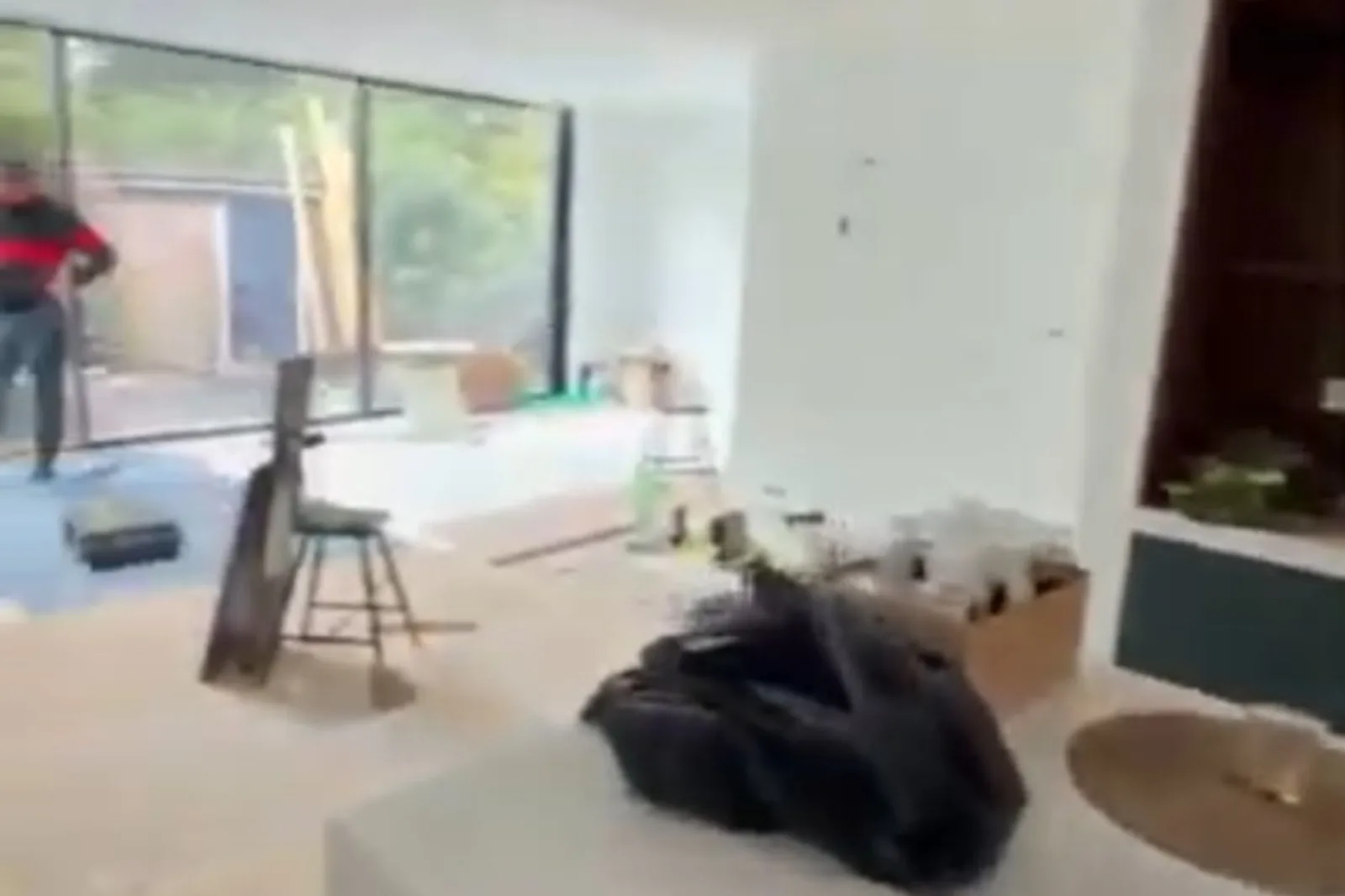
This project was about shaping a contrast kitchen where ink-dark cabinetry, white stone tops, and brass fittings open toward garden light. A waterfall island, sink run with wine fridge, and sage–walnut tall units compose a soft monochrome kitchen ready for daily cooking and hosting.
The challenge was to keep dark cabinetry soft, not heavy — balancing charcoal and sage volumes with thick white tops, brass taps, and garden glazing. Island, prep run, and tall storage had to read as one ink language while the open plan stayed bright under the skylight.
The brief was clear: an ink-soft kitchen with white stone, brass light, and garden calm — contrast without hardness.
Our approach centred the waterfall island as the social core, then aligned the dark sink run under the window with an integrated basin, brass faucet, and wine fridge. Handleless charcoal and teal-ink bases keep the line quiet.
From there we added warmer tall storage — sage panels, walnut niches, and an integrated oven — so the kitchen holds colour without breaking the soft mono story. Spotlights and open-plan light toward the garden complete the working room.
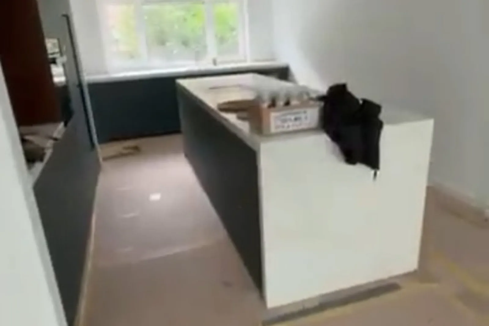
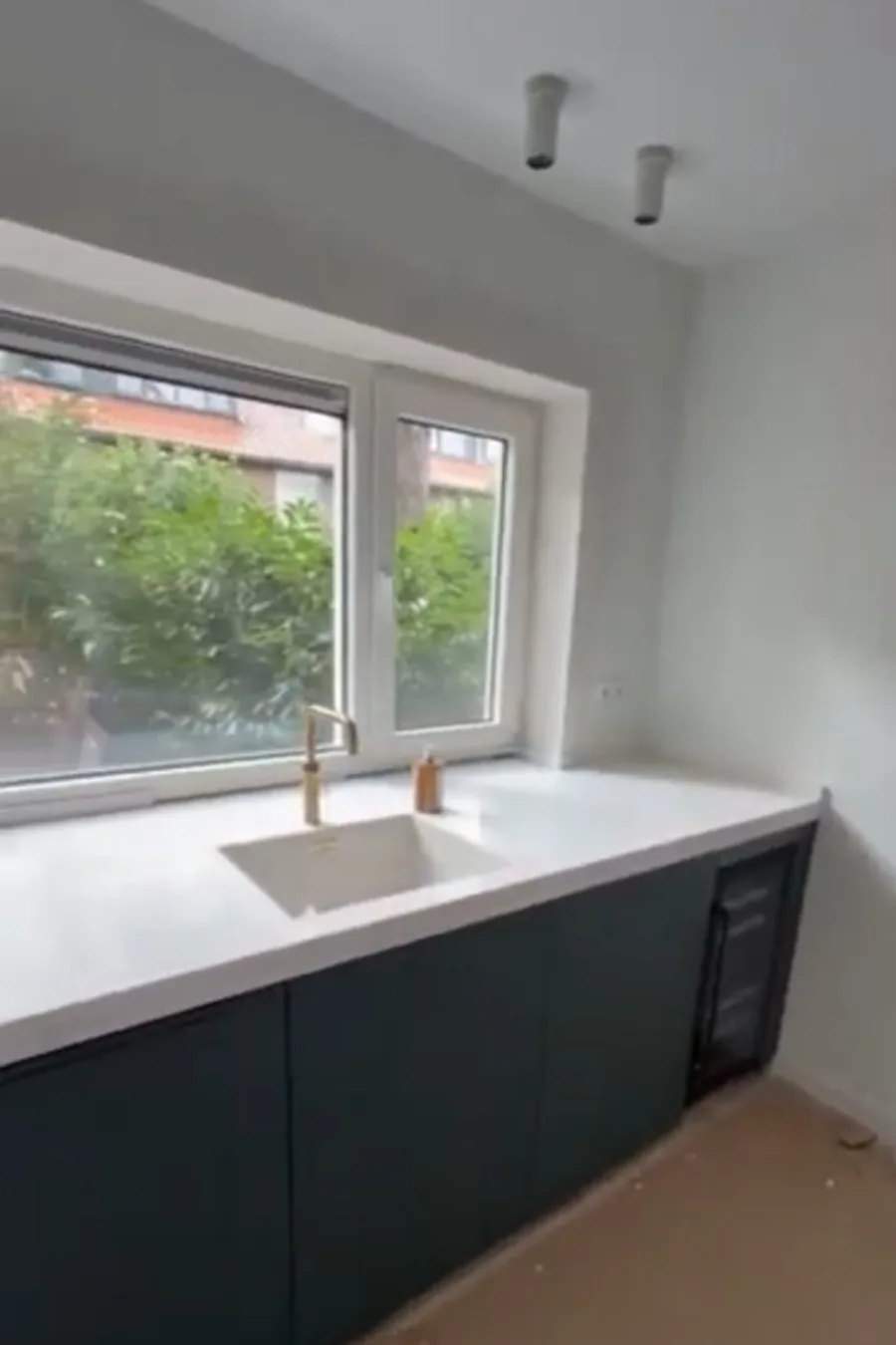
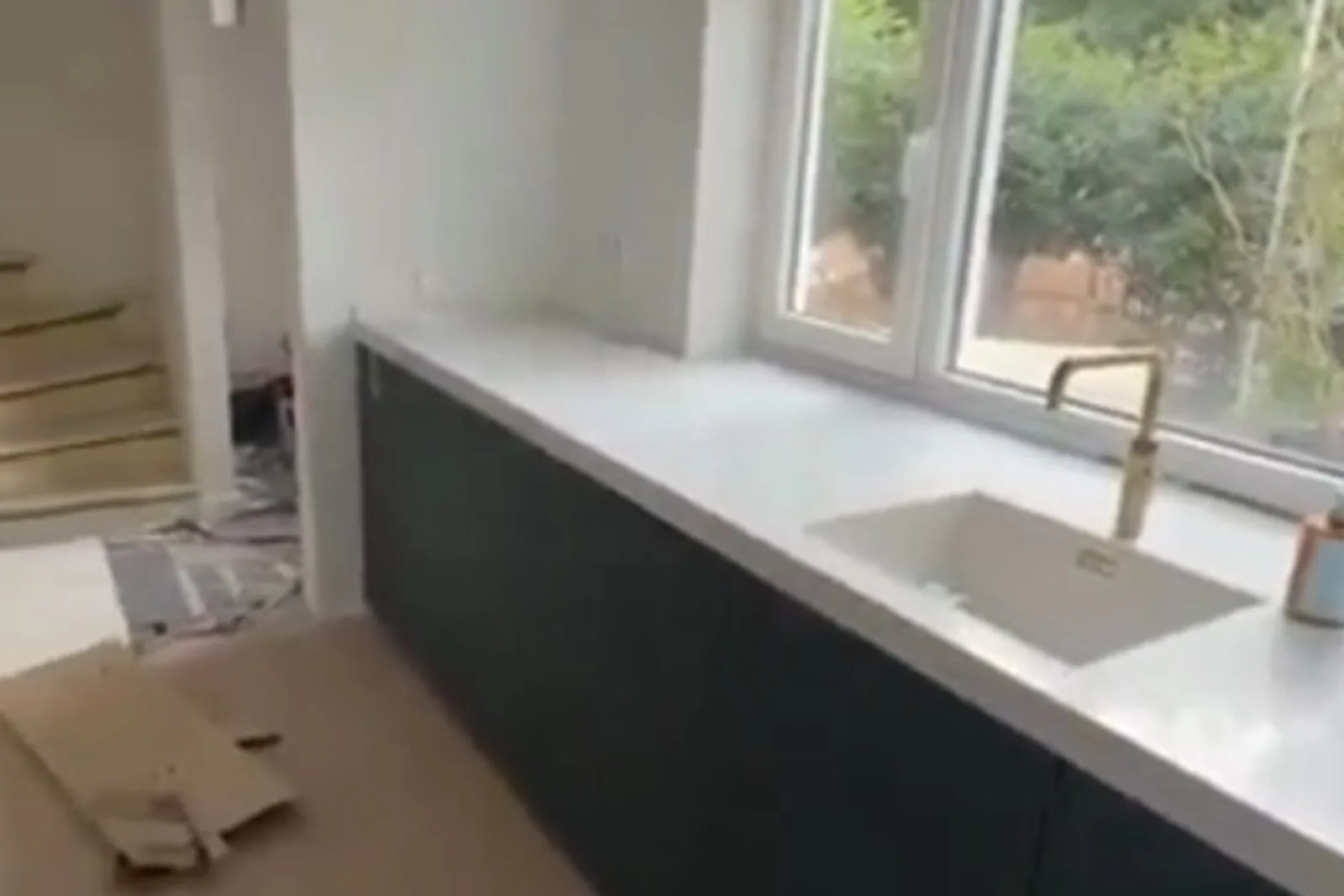
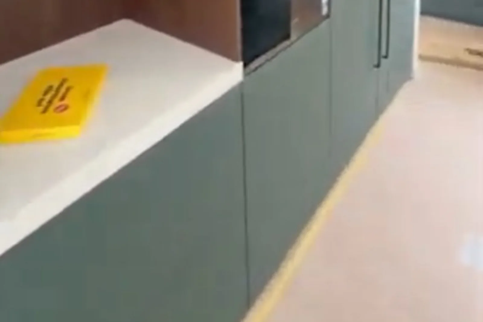
The outcome is a coherent ink kitchen: clearer island hosting, a precise window sink run, and tall units that soften the dark palette. White stone and brass keep the contrast calm.
Clients gain a high-end kitchen that photographs cleanly and cooks daily — from island prep to garden-facing wash-up. The space reads contemporary, soft, and ready for LU and NL urban homes.
These shifts translated into measurable improvements:
+52%
Contrast clarity between ink cabinetry and white stone
+48%
Island hosting capacity in the open plan
+40%
Task clarity on the garden-facing sink run
1
Unified ink, stone, and brass system